Caudill Sprouting: Updated
Product Catalog
Caudill Sprouting has built a reputation for themselves since starting their business 30 years ago. Headquartered in Louisville Kentucky, commercial sprout growers from all over the world turn to Caudill Sprouting to supply them with the highest quality sprout seed. They are one of the most trusted sprout seed supplier in the United States.
When I was approached with this project, the company needed to refresh their current business website to a more modern responsive website to meet the needs of their current client customer base. Once more, they also needed a way to highlight their current product catalog and distinguish themselves in a competitive wholesale market.
The Challenge
With so many competitors throughout the United States, it was obvious that reputation and size would not be an advantage. Buyers would have their pick of choosing from other sprout seed suppliers. I was assigned to create an exceptional user experience, while providing a high quality product.
Solution
In a 3 month timeframe, I had defined the Caudill Sprouting brand, led the design initiative, and developed a more user friendly website that was more enjoyable for users. During the project I kept all communication clear and elaborated everything involved each step of the way.
Process
In the first stage of the project, our goal was to get a good understanding of what the Caudill Sprouting needs were. To get these answers, we created a UX questionnaire.
After receiving this information, this is what they found most important:
- High quality product catalog with content and photography
- Easy call to actions
- Easy to use CMS
- Easily contact for more information

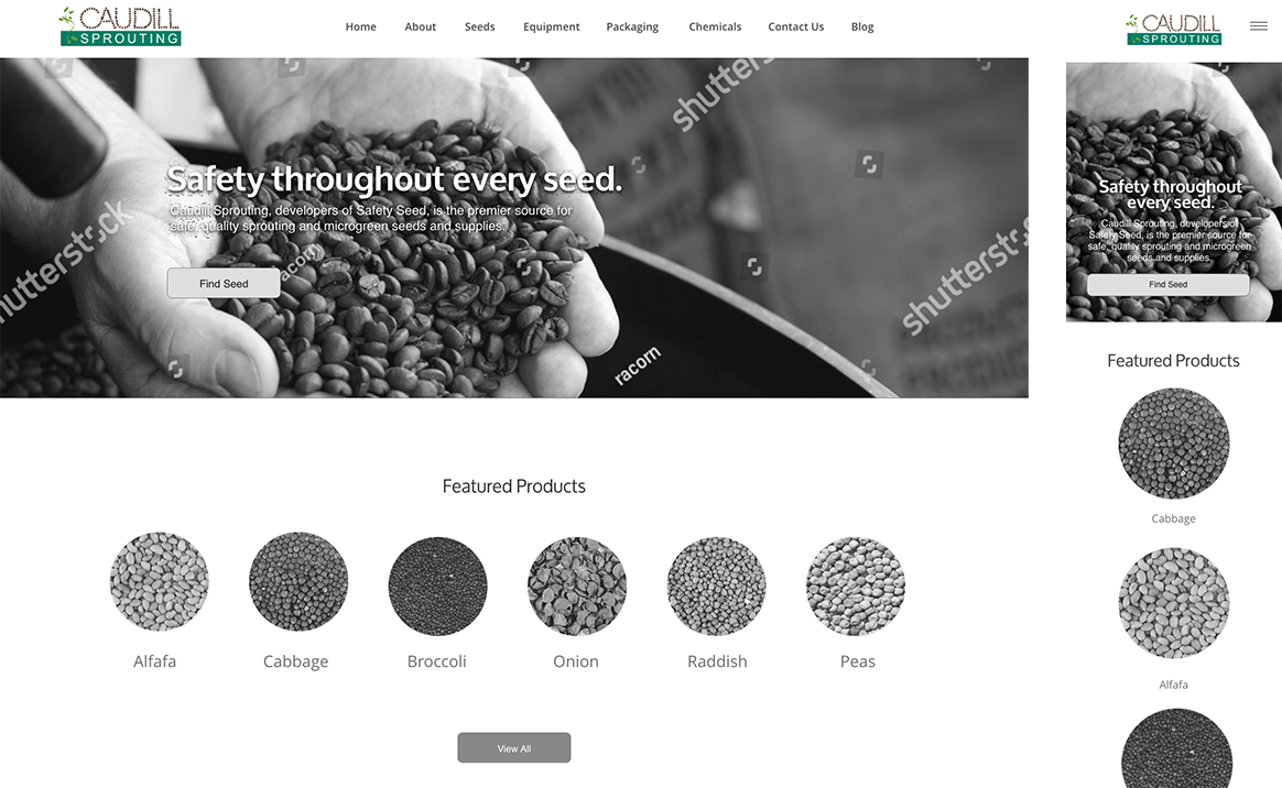
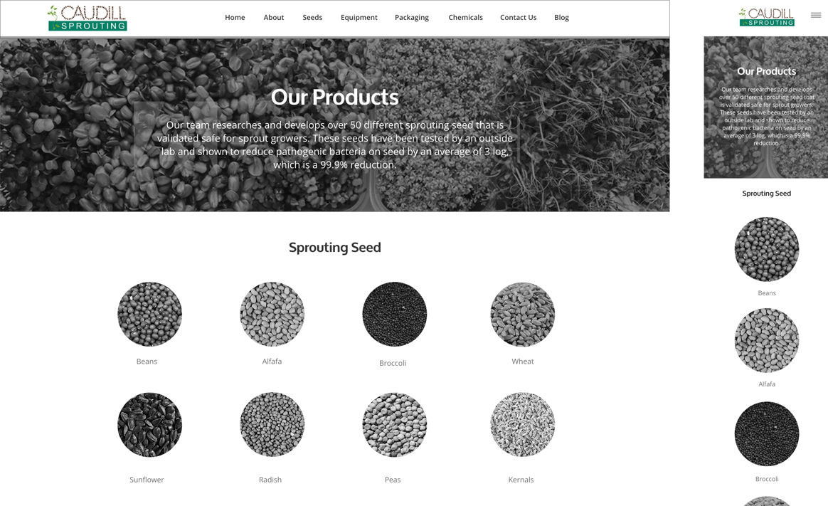
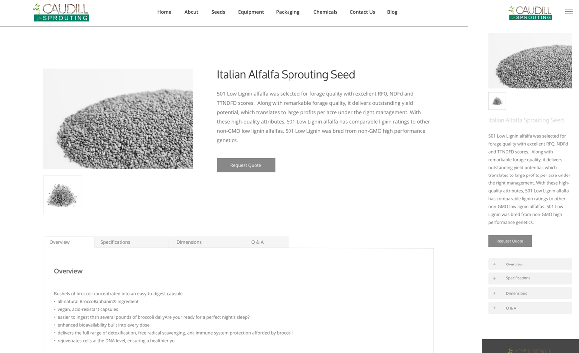
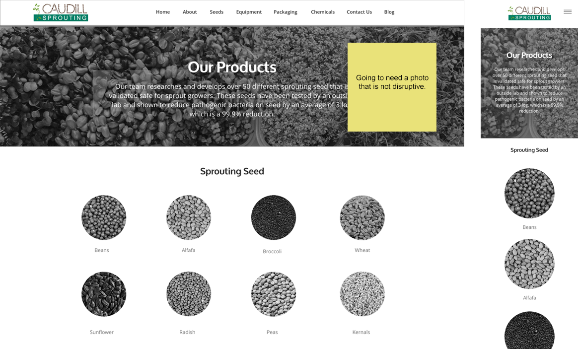
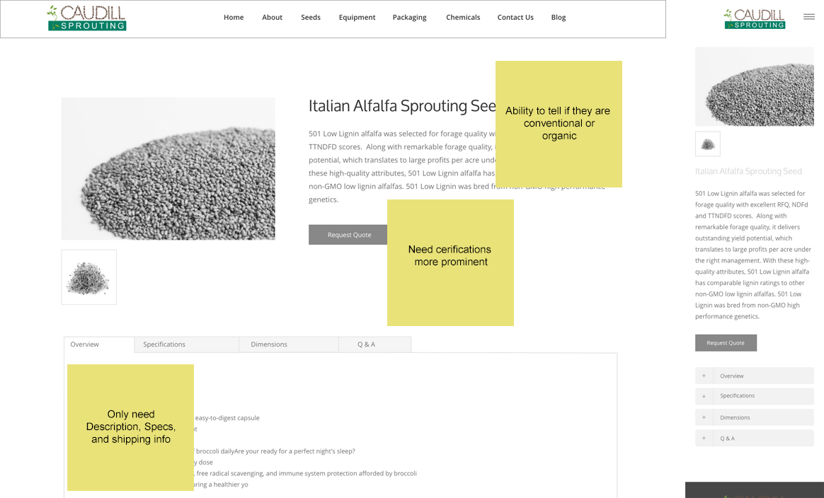
After gathering the information, we were then able to start building out the wireframes of the website. We started with the homepage, PLP, and PDP.
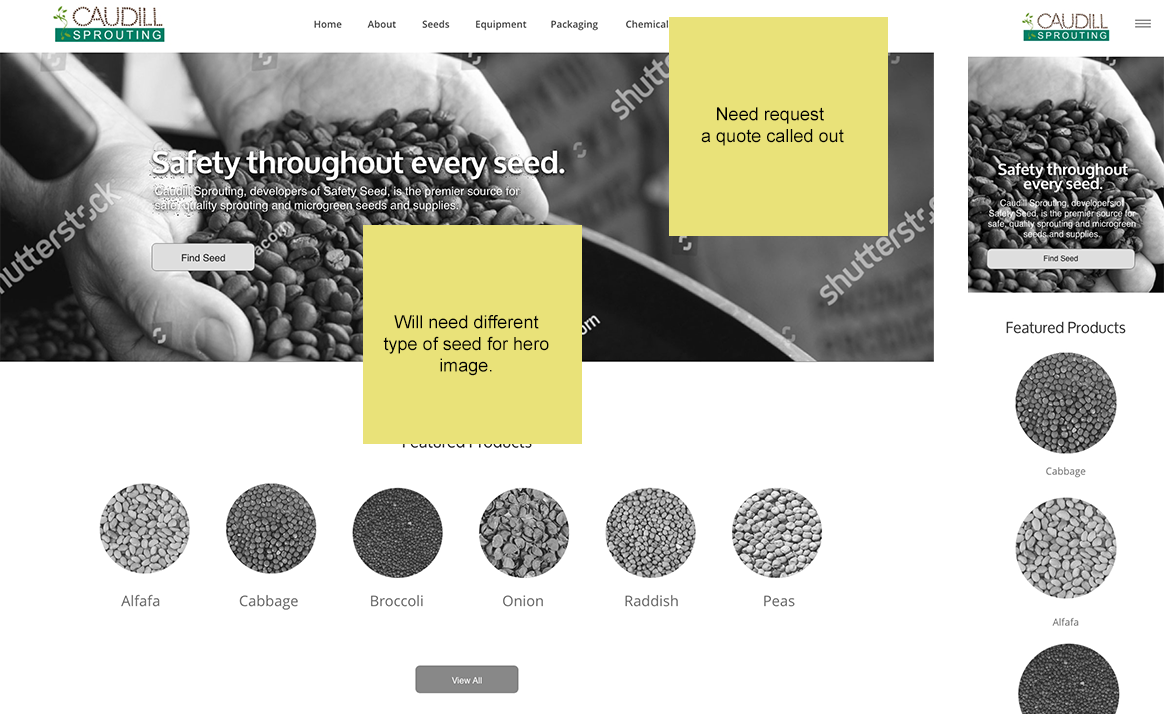
We then gathered feedback from the management team and made notes.
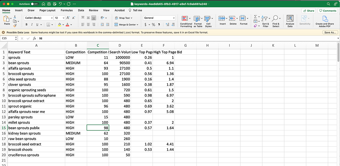
Our next step was to get content for each page of the website. To do this, we started researching keywords that they wanted to be known for.
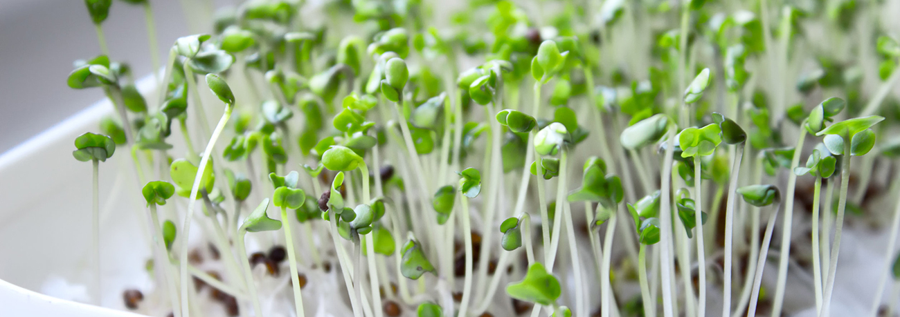
The last asset that was needed was photography. What they were needing was an all around view of their company as well as shots of their product as well. Here is a glimpse of what they got:
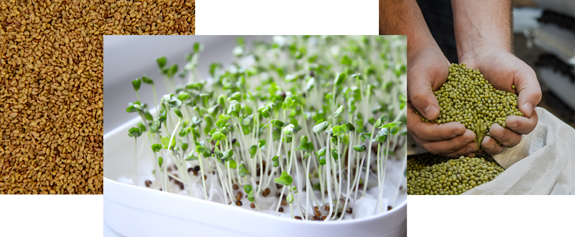
After having all of the critiical elements put together, we were then able to build out the website with imagery, text, color, and components for all pages. This was the final concept we came up with.
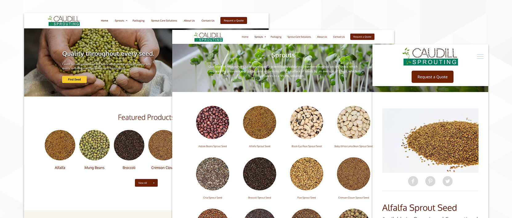
The Results
While the new website only recently launched (March 2019), it’s already showing some positive signs of new growth:
- 65% Time on Site
- 25% More Page Sessions
- Mobile Device Usage: Surpassed desktop usage for the first time due to mobile optimizations

